Welcome

Welcome to my As foundation level portfolio. Here you will find research and planning, construction evidence, and evaluation for my foundation portfolio.

Monday, 12 December 2011

Recce Of Location

Below is an idea of possible locations for my shoot. This will help me decide where is best.

Stanhope Park: This is a good location as it has lots of different spaces to take interesting shots. For example, by the trees, benches, grass, paths and walls. As it is outside we get a nice natural light which could work to our advantage on a sunny day, however, if the weather is bad this could be a down fall.


Darlington Arts Center: This is a good location because it is an interesting looking building with lots of old features to it. The red brick walls create a great background for a rock/indie magazine as it is urban, and the models will stand out against it. Because it is outside it gives a nice natural light, however, if the weather is bad on the day of the shoot it could be a downfall and may not be a brilliant place to take shots.

The Studio: This is a great place for photo shoots as it has special lighting, a back drop, and it is always dry as it is inside so therefore it is not weather dependent.
Although there are lights in the room it is not a natural or interesting looking mise-en-scene as the back drop is just plain and could look slightly boring, but this has great potential for cover shots.

Friday, 11 November 2011

Peer Assessment

This is a peer assessment of comments. This tells me what i need to change and what i should keep the same.
Positives
  • Genre is obvious
  • Bold text that is easy to read
  • Banner is bold and clear
  • Main sell line in good position
Negatives
  • Make image on front cover bigger
  • Title could be bolder
  • Contents page layout could be more picture dominated and less text so its more interesting and easier to read.
  • Put sell lines both sides of main image
  • Move bar code
Things i will change and improve on:
  • Make image bigger on front cover
  • Make contents pictures bigger
  • Put sell lines both sides of the image
  • Move the bar code
  • Edit tile and experiment with fonts

Changes Made to Flatplans


I have made a few changes to my magazine cover sketches as there were a few faults. I have decided to make my main image central as it will be more eye catching. I have changed the style of my font title as before it was hard to read and now it looks much clearer. the banner at the top has been made thinner to look neater. The bar code has been moved so that it is not covering any of the main image. Sell lines have been added to both sides to make the magazine look more full and realistic.
For the contents i have made a banner across the top of the page to be predominant so that it is the first thing to be read on the page in order for the reader to summarize the meaning of the page. I have made the main picture larger and to the left in order to leave enough space to make a column that will list the features of the magazine. I have added another picture in the bottom right corner to make the page more interesting.

Flat Plans

This is a flat plan for the front cover of my music magazine. The name i have decidedf to call my magazine is 45RPM, the reason i have chosen this name is because it is short and snappy and relates to music. I have decided i will use 1 image on my front cover and i think it will be a medium close up, however, i will make thye image go underneath all of my writing on the cover as it will be more interesting and eye catching, unlike this drawing. I will use colours that are unisex for my writing and title as it will best suit my target audience. I dont think my flat plan is an exact image of my magazine as it is difficult to imagine what the final product will be like. The background of the frontcover, behind my model will be plain to make my model stand out and be the main attr4action. I will add more sell lines in the real thing and especially on the right as i have not put any on that side in my flat plan. I will make the font bold and easy to read and keep the same colour and style throughout my magazine, on the contents page and the double page spread also. I have placed my main sell line across the bottom of the front cover to draw the readers attention.I chose to make the main sell line large as it is the main feature other than the photograph and will inform the reader who the person featured on the cover is if they have not seen them before.

 This is a flat plan of my contents page. I have decided to make the heading "INSIDE" because its short and snappy and straight to the point. I will keep the colour sheme the same on this page as the cover. The contents page background, a lot like the cover will stay reasonably plain to make any images used stand out. i have boxed in each sell line to make it look neat however i do not intend to keep it like that for my real thing as it looks too boring and un interesting. The pahe numbers will be a sepourate colour from the rest of the text to make it easier to find and stand out. I will also have on my contents page a number of advers, this will make my magazine more realistic and interesting. The main interview will be written in large letters of the name of the band and underneath will be a quote from the interview to interest the reader further. I have also decided to have one main image in the center of my contents page to make it more interesting, however, i have decided i will have more than 1 on the final product. This will make the page less dull and more exciting.

This is a sketch of how i would like my double page spread to look. I would like an image to dominate the left page to make it look more appealing and to catch the readers eye. i have decided to write my article on the right page and into 3 different columns to break up the text a bit and to still make it look professional. i have decided that i will put a background onto the page being all the text and images to make the page look more interesting and to draw the reader in. i will use a colour theme of red black and white, just like the rest of my magazine to keep the theme on going. However, although i will keep the theme going, i am going to create some variation  of colour by adding different colour in my images.

Tuesday, 8 November 2011

Planning My Article

I will write an introduction in my magazine article. It will draw the reader in and make them want to read more.
I will write in third person as i think it will be easier to relate to the artist.
I am going to write my article as question and answer as it will be easy to read and straight to the point. It will appeal more to my target audience as they wont want to read lots and lots of text in big paragraphs. I will also write a short introduction about my artist/s featured, giving the reader some background information and informing them on who the artist/s are, what kind of music they produce, album name/s, new music, how long they have been around etc.

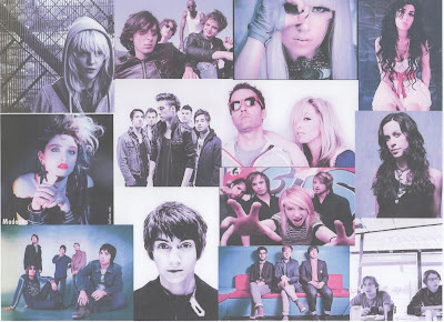
Inspirational Images Moodboard


This is a moodboard of images that i have found inspirational for my magazine. I have carefully selected ones that i think work with the genre of my magazine which is Indie/rock. The images are of both male and female as it will best suit my target audience. I have found the images inspirational as the location that they use are all interesting. The poses are all confident and bold and the costume makes a statement about the artist. The light that is used also is inspirational as in each of the images it is used differently.

Image Analysis and Composition

The model seems confident in their body language but not too in your face. its difficult to see the models eyes which makes them a bit mysterious yet we can half see them. This could perhaps show that they are not too overly confident as well.
the setting (by the wall) is interesting and is more exciting. the graffiti on the wall in the bottom right implies attitude and outrage! The models out fit is toned down yet still perfectly acceptable .
The Tattoo on the singers arm is visible so showing that he has a distinctive way about him.


The Models all look confident with their body language. They are all catching the audiences eyes by looking straight at them. The image is taken from above so this normally would make the model/s look more vunerable however their poses out weigh the angle of the camera.
The area that they are in looks quite rough so that this creates attitude about the model and could seem quite threatening. Also the location is more interesting than a studio and gives the image more variation.

Research into institutions that distribute similar products

KERRANG!

http://www.mediauk.com/owners/88/bauer-media
http://www.kerrang.com/  

19th January 2012


Baur  make a large range of magazines. For example T.V, Motorcycle, Music, Garden and Cooking
A "big name" magazine they produce is "GRAZIA" and a niche magazine is "Bird Watching"
Other big names are:


  • Heat
  • Grazia
  • FHM
  • MOJO
I dont think i would put my product on their list as there is too much other competition of popular music magazines with a similar genre to mine and this is not creating a wider range for the company.


NME

http://www.ipcmedia.com/

19th January 2012

IPC Media make a large range of magazines. For example Sport, Design, Pornography, Animal and T.V
A "big name" magazine they produce is "NOW" and a niche magazine is "yachting world|"
Other big names are:

  • Look
  • TeenNow
  • Soap Life
  • TV Times

I thing they would be interested in adding my magazine to their list of other products as it has a very similar genre to NME and they dont produce any other music magazines, this could give them a bigger and wider range and there will be less competition between magazines.

Primary Audience Research

i conducted some primary audience research in order to:

  • find out what appeals to my target audience
  • to discover any flaws or potential improvements that could be made to my magazines genre
  • to identify if there are any gaps in the market and place a refreshing new twist on the genre. 

  1. What do you like about the layout?
  1. What do you like about the colour scheme?
  1. What first attracts your attention?
  1. How should it be laid out?


    These are an example of the kind of product i intend to make myself. They give a good idea of style, colour, fonts, photographs, interviews etc. i will ask my target audience what they think of these examples, this will then help me decide on what my audience like and dislike and how i can make my magazine as appealing as possible for them.

    My Questions:
     

    From this i have decided:

    Monday, 7 November 2011

    Secondary Research

    Audience Research 
    The genre of music i have chosen to base my magazine on is rock and indie. To research into what the current popular magazines are like i have chosen to look at NME and Kerrang, both of which have a similar genre to my own. This will help me create a magazine image that will appeal to my target audience. I will look at how the pages are laid out, what fonts and colours are used, the style of image and the interests of my audience.


    NME Music Magazine
    NME's is a very well known music magazine in the UK. It tends to focus on rock and indie music and this influences the style of the reader, for example, their look, their habits and the music that they listen to. A large percentage of NME readers think that it is important to be well dressed, be well informed about things, its worth paying extra for quality goods and they spend a lot of money on clothes. The average age of the reader is 24 and a high percentage states that the readers are male, that work full time. The bands that feature on the cover are usually male artists, this is to create an icons for them. To make them want to dress, look and have the same style. If a female is featured, this is not as common, but this is to create a sex icon.


    Kerrang Music Magazine
    Kerrang is also a very well known music magazine in the UK. Again Like NME the target audience tends to be young adult males around the age of 19. The music that the magazine is based around is loud and full of attitude. The readers tend to be intelligent and desire to be individual. Also they like to keep up to date with the latest technologies and fashion, a lot like the readers of NME. 


    My Customer Profile
    I have created my own customer profile for my magazine. it is a lot like KERRANG's and NME's as it is a very similar genre and target audience.


    Tuesday, 1 November 2011

    Textual Analysis


    Brief

    PRINT

    Preliminary exercise: using DTP and an image manipulation program, produce the front page of a new school/college magazine, featuring a photograph of a student in medium close-up plus some appropriately laid-out text and a masthead. Additionally candidates must produce a DTP mock-up of the layout of the contents page to demonstrate their grasp of the program.

    Main task: the front page, contents and double page spread of a new music magazine.
    All images and text used must be original, produced by the candidate, minimum of FOUR images per candidate.

    Sunday, 30 October 2011

    Print Prelim Product and Evaluation


    • i have used similar layouts to magazines such as Elle and Vogue.
    • I used a medium close up which professional magazines use.
    • i used bright colours to attract my audience and to math the title @fresh" as blue white and represent freshness
    • i used a bold font so its easy to read and suitable for both sex
    i have learned a range of skills, using Blogger, Photo shop and in design.

    i learned how to create a professional looking cover using photoshop. 
    i have learned how to create a professional contents page using in design.
    i have also learned to upload a photo and text to blogger.

    Wednesday, 14 September 2011

    Photography Composition

    Flat plans & rationale

    I have chosen to lay out my front cover like this as it looks professional and clear for the reader. I have put the sell lines at the sides of the photograph but will be going over part of it so that you can still see the photograph clearly but so all the sell lines are not in separate boxes as this could make the cover less exciting and too orderly. The colour scheme i will use is blue, green and white as this links with the title of the magazine "fresh" these three colours are fresh, clean colours and are unisex as it will be both boys and girls that read this magazine. the bar code will be at the bottom to keep it out of the way of all the information and images. The font will be bold and clear so its easy to read from a distance and eye catching! The date and issue number are at the top of the page along with a bold large title so that the reader knows when it was written and to identify the magazine.

    I have laid out my contents page in blocks as it makes it clear and more organised for the reader. For example " every issue" this separates certain pages from the rest so that if the reader enjoys that page every week its quick and simple to find what page its on. i have laid out photographs so that they catch the eye of the reader but so that there is still enough space to write whats in that issue on what page etc.

    Tuesday, 13 September 2011

    Cover and contents page of inspiration

    Below are examples of magazine covers and contents pages that i am taking inspiration for my prelim.
                                     
    On the front cover of this vogue magazine it has a photograph of Victoria Beckham in medium close up as a background, the title "Vogue" is written in block capitals and big font at the top of the page, it is also written in bright pink to show a contrast to its backgrounds colour theme this makes it stand out and catch the readers eye.
    using similar fonts, the sub-headings are  written down the sides of the cover. the designer has decided to use a colour theme of pink and white-to stand out and black to make it clear and easy to read and has been carefully selected to be put in the correct places where it stands out.
    Different sizes of font have been used to make different parts clearer and stand out from the rest of the text, this makes it easier to read from a distance and to draw in the reader.
    a price tag is on the left hand side on the top corner, this informs the reader how much it costs but small enough so it doesn't stop the reader from buying if its expensive.


    "ELLE" has a similar layout, big, bold title to stand out. a mid-zoom photograph of the model as the background. the colour scheme is the same as the "VOGUE" one above to stand out from its background and to be girly and flirtatious, this helps attract the target customer. Again different size fonts have been used to make different things stand out, i.e the name of the person who's photos on the front cover, free gifts etc.
    a bar code has been placed at the left hand bottom of page to keep out of the way of the photo and information and so its easier for the seller to scan.


    This is a layout of the "VOGUE" magazine contents page. at the top is a photograph of models, maybe promoting a clothing range or maybe they are some form of celebrity, it draws in the reader as there is not lots and lots of text to read through but something to look at and bright colours always make it appeal more interesting.
    Underneath there are the page numbers written in a large font, next to each number is a small amount of text to draw the reader in but not so much that the reader has to read for 10 minutes to find what the page is about. A certain type of language will be used to grab the readers attention and make them want to look at the page.
    also at the top it has the month written, this helps the buyer understand what the theme/season will be that particular month for example if its December they will realise its a winter issue.


    This is the same as above a contents page but this time from "ELLE" magazine, it has many similarities and a few differences. all around the edge images are placed to make a border for the text, the designer has decide to chose all girly things such as make up, celebrities and models to border the page to grab the audience and make it more appealing for them. inside the border the same layout has been used as "VOGUE" large page number to head and a small amount of text, in a small font has been used to inform the reader on what its about. There are a few sub-headings to group certain things together, for example "in every issue" is a title at the bottom, if you are a regular buyer then this could be useful to have all of these pages in their own collum to make it easier to find.

    Monday, 12 September 2011

    Brief:Print

    Prelim exercise: Using DTP and an image manipulation program, producing the front page of a new school magazine featuring a photo of a student in medium close up plus some appropriately laid out text and a masthead. Additionally, mock up the contents page.

    Main Task: the front page, contents and double page spread of new music magazine.

    a minimum of four images must be used. all images and graphics must be produced by the candidate.