Sunday, 15 April 2012
Evaluation Question 6-What have you learnt about technologies from the process of constructing the product?

I have ussed technologie such as, cameras, laptops and macs.
During the production of my product i learnt a lot. for example i learnt how to identify a good shot from a bad shot by using simple methods like the rule of two thirds, framing your shot before taking it, balancing the camera carefully bu keeping your arms close or using a tripod.
I have also learnt a lot by using a mac. It has made a lot of benefits to the production with regards to how fast and easy it is to use and the programmes available.
Using photoshop has benefited me hugely as i could not use it at all to begin the process and it caused me a lot of stress, however, i feel like i am confident with it now and i know what i am doing. I can edit photographs and make my own images easily.
Indesign has also benefited my product in a big way as it has made it much easier to structure it and create a base for the layout. It allowed me to create columns in which i entered text in a neat way.
I have also learned a lot by constructing and maintaining a blog. it has made a clear outline of the production process and it has helped me keep track of what i have done.
Tuesday, 27 March 2012
Evaluation Question 5-How does your magazine attract your audience?
For my primary research i asked my target audience what they wanted from a music magazine and they answered with the following:
- striking images
- interesting layout
- bold colours
- lots of pictures
- lots of information


Evaluation Question 4-Who would be the audience for your media product?
I have decided to make a moodboard in order to show who i think my target audience will be/who i have aimed to be my target audience! These are a few of the things that i think they will like. drinks, tv programmes, music/bands, entertainment in spare time, shops etc.
in my secondary research i found that my target audiences ages 16-24 and both male and female.
Monday, 26 March 2012
Wednesday, 22 February 2012
Tuesday, 21 February 2012


Monday, 20 February 2012
Rough cuts


Here are some of my rough cuts to show how i have created my product. i have experimented with a few different colours and fonts. after a few attempts i have figured what looks best.
After asking others what they think of my product so far people have said that it looks good but needs more work in order for it to look professional. some suggestions are:
"add more sell lines"
"add some images in small, perhaps to advertise posters inside"
"add a barcode"
some positive comments from target audience:
"great colours and layout"
"eye catching cover photo"
"bold main sell line"


Production Update
6 weeks until Easter.
4 weeks on construction
Monday 5th March-Rough cut of final product
Monday 19th March-Deadline for final product
Monday 19th March-Friday 30th March- Working on evaluation questions
Monday 16th April-Complete portfolio hand in
I will meet these deadlines by working on it in every spare minute i get.
I will also organise my time and plan what i am going to do before each session, this will make it easier to complete and more organised.
4 weeks on construction
Monday 5th March-Rough cut of final product
Monday 19th March-Deadline for final product
Monday 19th March-Friday 30th March- Working on evaluation questions
Article Drafts - 22nd February
I have set myself this as a deadline to complete research and a rough draft of my article. This will create enough time to alter it if i need to before the final hand in date.
Photography - Wednesday 30th February
This is a deadline i have set myself to have all the photography complete by. This is a reasonable time to have all this done by and yet it still keeps things organised.
Double Page Spread and Contents Construction - Friday 3rd March
I have set myself the deadline of this date, as I feel this deadline is something I can be working on after I have my article draft.
I have set myself the deadline of this date, as I feel this deadline is something I can be working on after I have my article draft.
Front Cover Construction - Wednesday 6th March
This is a reasonable amount of time to complete my front cover as i can be working on it as soon as the photography is complete.
Final Construction - Tuesday 16th April
I have set myself this deadline for final construction because it gives me 24 hours to finish off anything that needs to be done before the hand in date.
Monday 16th April-Complete portfolio hand in
I will meet these deadlines by working on it in every spare minute i get.
I will also organise my time and plan what i am going to do before each session, this will make it easier to complete and more organised.
Saturday, 11 February 2012
Test Shots
To get used to working the camera, position of the model and whether an out door and an indoor location looked best we took some test shots.
 The First image i took was of my model against a brick wall. This was good because it made my model stand out from the background yet it created some variation away from a studio. I decided to take it at the end of the building so that i got some of the surrounding area making the image more interesting and to break it up from just the red brick. The position of the model however was not as good as the light shone in the direction of the wall, creating the model to squint slightly, this does not create a powerful image for my magazine.
The Pose of the model is not quite bold enough for my magazine as i want my model to make a statement. The position of the model in this picture is vulnerable and shy looking, i would like my model to look confident and bold. As a result of all these things there is a possibility that my model will be against a wall like this however i will change the pose.
In this image i have two models, standing slightly
 apart but facing slightly inwards. This shows that they are together and is a very popular magazine styled shot. This time i decided to get my models to face away from the light to see how the image would take. I liked the way the light came from behind emphasizing their hair and outlining their bodies, however, as the camera was facing the light it created a glare on the lens, also it shaded out the faces of my models making them darker and harder to see. This may not be a good thing in a magazine as the models will not stand out to the audience. As a result i have decided that if i sue two models then i will use this position as it makes a statement but i may not use this type of light.
 As i tried some shots out of the studio i decided to try some shots in the studio to experiment and to see how different my images would be.
The light in the studio in this image is good because it emphasizes the models faces and creates a bolder more confident image, however, the image taken was taken too far back especially if it was for a cover. Also the pose that the models are in to not make a large statement. As a result i have decided i like the studio but i dislike the distance of the camera and the the models are in.
 In this image i have focused on the head and shoulders, this is a good distance for a cover shot as it focuses on the models main feature, face. The light is good as it emphasizes my models face and stands out from the dark background.
The pose is good as the models ;looking directly at the camera and this would be good for a cover page as the model is looking directly at the reader, luring them to read more. However the shoulders are low, to make a statement in my magazine i want the model to stand tall and look confident. As a result i have decided i will use a medium close up shot and i will have my model look directly at the audience. I will also definitely use the studio as i like the light it gives.
The Pose of the model is not quite bold enough for my magazine as i want my model to make a statement. The position of the model in this picture is vulnerable and shy looking, i would like my model to look confident and bold. As a result of all these things there is a possibility that my model will be against a wall like this however i will change the pose.
In this image i have two models, standing slightly


The light in the studio in this image is good because it emphasizes the models faces and creates a bolder more confident image, however, the image taken was taken too far back especially if it was for a cover. Also the pose that the models are in to not make a large statement. As a result i have decided i like the studio but i dislike the distance of the camera and the the models are in.
In this image i have focused on the head and shoulders, this is a good distance for a cover shot as it focuses on the models main feature, face. The light is good as it emphasizes my models face and stands out from the dark background.The pose is good as the models ;looking directly at the camera and this would be good for a cover page as the model is looking directly at the reader, luring them to read more. However the shoulders are low, to make a statement in my magazine i want the model to stand tall and look confident. As a result i have decided i will use a medium close up shot and i will have my model look directly at the audience. I will also definitely use the studio as i like the light it gives.
Friday, 10 February 2012
Evidence of Organisation of Props, Costume and Make-up

This will help make clear my target audience and the style/look that they idolize.
Dark eye make up is very popular when it comes to magazine photographs as it makes the models facial features stand out more.


It is an individual and unique style that makes the model stand out from other singers. Her short blonde hair also builds up a look.
High waisted denim shorts, patterned black tights, lace top, pink converse and leather jacket make up her costume.
Also small accessories such as belt, earrings (stretchers and studs), tongue, lip and nose bars and grey socks create more of an edge to her look and build up a real rock star style.
Sunday, 5 February 2012


Saturday, 4 February 2012
Call Sheet

Character : Photography model
Release form signed? : Yes
Shooting day : 21/02/2012
Location : Darlington
Producer : Lauren Potter
Director : Lauren Potter

Character : Photography model
Release form signed? : Yes
Shooting day : 21/02/2012
Location : Darlington
Producer : Lauren Potter
Director : Lauren Potter

Character : Photography model
Release form signed? : Yes
Shooting day : 21/02/2012
Location : Darlington
Producer : Lauren Potter
Director : Lauren Potter

Character : Photography model
Release form signed? : Yes
Shooting day : 21/02/2012
Location : Darlington
Producer : Lauren Potter
Director : Lauren Potter

Actor : Jonathan Driver
Character : Photography model
Release form signed? : Yes
Shooting day : 21/02/2012
Location : Darlington
Producer : Lauren Potter
Director : Lauren Potter
Friday, 3 February 2012
Risk and Hazard assessments
These are my risk and hazard assessment forms that I have filled out show the risks and hazards that might take place in the studio.


Sunday, 1 January 2012
My Article
This week’s exclusive interview is with the fabulous Rubber Kicks!
Rubber Kicks are the biggest thing this year. They are a Northern rock band that has been influenced by the greatest rock gods of our time, such as: OASIS, THE LIBERTINES and MUSE! They have had the longest number 1 since Michael Jackson. 4 incredible singles, and 3 big awards all in 1 year. How did they do it? They are here to tell us exactly how they did!
So guys, a big year for you lot! How does it feel, going from garage practices to huge stages? Plus having one of the biggest fan bases England has ever known?
Yeah, god its crazy I still can’t believe it now, is so surreal. Phones ringing 24/7, radio’s blasting our tunes. It’s so overwhelming and really flattering actually, there’s nothing like when people recognise your music and appreciate it!
So, how did you guys get yourselves so well known? As well all know how hard it is to get recognised this day and age.
Well this is what makes our story even more exciting. None of us had ever pushed for stardom it was just a hobby, I guess we got lucky. We did a few gigs in our local town, mainly in the summer. We also put a few of our tunes on YouTube and that was it, the next minute we were signed and our records were being sold. It’s been a mad year.
I bet! So, your first big single “the stars of new York city” has made it large in the chart, is there anymore songs like that on the way?
Erm....Yeah...well sort of! Like we still have a few tracks yet to release but they are totally different to this. That how we wanted our band to be, like each track to be different and for us to be known for having a big variety of tracks. Each day we learn new things and if some of our tracks don’t do as well we can learn by that and see what the fans like best. It’s still all very new for us!
So, any tours this year? Or are you going to wait a while yet?
Well nothing is set in stone yet but we hope to begin our tour next January. This will give us plenty of time to organise ourselves properly and polish up our performances.
Sure! Who would you say you guys aspire to be like?
God! There are so many people we idolise! To have a voice like Laura marling or to have the charisma of Liam Gallagher and to be as close band mates like stereophonics but to still have the attitude of the libertines would be perfect, but perfect doesn’t exist!
Did you guys go to any gigs when you were younger?
Yeah, loads! We still do in fact. We went to Leeds fest like every year since we were like 14 and went to loads of other gigs. Stereophonics, The Maccabees, Noel Gallagher, The Libertines, Babyshambles, Enter Shikari...just loads!
You all have this unique kind of look, what influenced that?
Well, we all suffered from bullying at school and college and stuff. People said things about how you looked or what your hobbies are or what music you listened to, well we all ended up being the same as everyone else at one point and then when we formed the band we realised that we all looked so much better when we were individual and it was our way of sticking two fingers up at the rest of the world! (laughs)
I bet so many readers can relate to this in some way! So, because of this some of your music is written purely about that point in your lives?
Yes! Definitely! Our track “fake smiles won’t cover for you” is written purely about that crappy time. But we all learned to get over it and it has made us what we are now!
Well guys, it’s been great talking to you. Best of luck with this year and we hope to hear a lot more from you soon.
Thank you! Yes you certainly will! Our new single will be released on the 18th of March so listen out! Peace out.
Monday, 12 December 2011
Recce Of Location
Below is an idea of possible locations for my shoot. This will help me decide where is best.

Stanhope Park: This is a good location as it has lots of different spaces to take interesting shots. For example, by the trees, benches, grass, paths and walls. As it is outside we get a nice natural light which could work to our advantage on a sunny day, however, if the weather is bad this could be a down fall.


Although there are lights in the room it is not a natural or interesting looking mise-en-scene as the back drop is just plain and could look slightly boring, but this has great potential for cover shots.
Friday, 11 November 2011
Peer Assessment
This is a peer assessment of comments. This tells me what i need to change and what i should keep the same.
Positives
Positives
- Genre is obvious
- Bold text that is easy to read
- Banner is bold and clear
- Main sell line in good position
- Make image on front cover bigger
- Title could be bolder
- Contents page layout could be more picture dominated and less text so its more interesting and easier to read.
- Put sell lines both sides of main image
- Move bar code
- Make image bigger on front cover
- Make contents pictures bigger
- Put sell lines both sides of the image
- Move the bar code
- Edit tile and experiment with fonts
Changes Made to Flatplans

I have made a few changes to my magazine cover sketches as there were a few faults. I have decided to make my main image central as it will be more eye catching. I have changed the style of my font title as before it was hard to read and now it looks much clearer. the banner at the top has been made thinner to look neater. The bar code has been moved so that it is not covering any of the main image. Sell lines have been added to both sides to make the magazine look more full and realistic.
 For the contents i have made a banner across the top of the page to be predominant so that it is the first thing to be read on the page in order for the reader to summarize the meaning of the page. I have made the main picture larger and to the left in order to leave enough space to make a column that will list the features of the magazine. I have added another picture in the bottom right corner to make the page more interesting.
Flat Plans
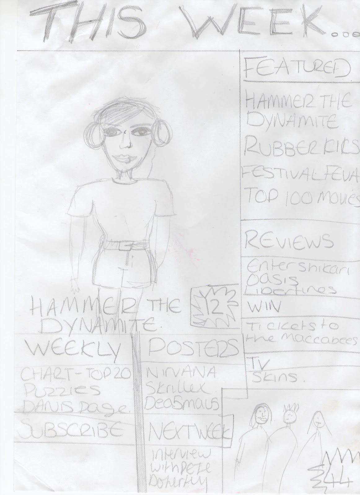
 This is a flat plan for the front cover of my music magazine. The name i have decidedf to call my magazine is 45RPM, the reason i have chosen this name is because it is short and snappy and relates to music. I have decided i will use 1 image on my front cover and i think it will be a medium close up, however, i will make thye image go underneath all of my writing on the cover as it will be more interesting and eye catching, unlike this drawing. I will use colours that are unisex for my writing and title as it will best suit my target audience. I dont think my flat plan is an exact image of my magazine as it is difficult to imagine what the final product will be like. The background of the frontcover, behind my model will be plain to make my model stand out and be the main attr4action. I will add more sell lines in the real thing and especially on the right as i have not put any on that side in my flat plan. I will make the font bold and easy to read and keep the same colour and style throughout my magazine, on the contents page and the double page spread also. I have placed my main sell line across the bottom of the front cover to draw the readers attention.I chose to make the main sell line large as it is the main feature other than the photograph and will inform the reader who the person featured on the cover is if they have not seen them before.
This is a flat plan of my contents page. I have decided to make the heading "INSIDE" because its short and snappy and straight to the point. I will keep the colour sheme the same on this page as the cover. The contents page background, a lot like the cover will stay reasonably plain to make any images used stand out. i have boxed in each sell line to make it look neat however i do not intend to keep it like that for my real thing as it looks too boring and un interesting. The pahe numbers will be a sepourate colour from the rest of the text to make it easier to find and stand out. I will also have on my contents page a number of advers, this will make my magazine more realistic and interesting. The main interview will be written in large letters of the name of the band and underneath will be a quote from the interview to interest the reader further. I have also decided to have one main image in the center of my contents page to make it more interesting, however, i have decided i will have more than 1 on the final product. This will make the page less dull and more exciting.

Tuesday, 8 November 2011
Planning My Article
I will write an introduction in my magazine article. It will draw the reader in and make them want to read more.
I will write in third person as i think it will be easier to relate to the artist.
I am going to write my article as question and answer as it will be easy to read and straight to the point. It will appeal more to my target audience as they wont want to read lots and lots of text in big paragraphs. I will also write a short introduction about my artist/s featured, giving the reader some background information and informing them on who the artist/s are, what kind of music they produce, album name/s, new music, how long they have been around etc.
I am going to write my article as question and answer as it will be easy to read and straight to the point. It will appeal more to my target audience as they wont want to read lots and lots of text in big paragraphs. I will also write a short introduction about my artist/s featured, giving the reader some background information and informing them on who the artist/s are, what kind of music they produce, album name/s, new music, how long they have been around etc.
Inspirational Images Moodboard

This is a moodboard of images that i have found inspirational for my magazine. I have carefully selected ones that i think work with the genre of my magazine which is Indie/rock. The images are of both male and female as it will best suit my target audience. I have found the images inspirational as the location that they use are all interesting. The poses are all confident and bold and the costume makes a statement about the artist. The light that is used also is inspirational as in each of the images it is used differently.
Image Analysis and Composition

The model seems confident in their body language but not too in your face. its difficult to see the models eyes which makes them a bit mysterious yet we can half see them. This could perhaps show that they are not too overly confident as well.
the setting (by the wall) is interesting and is more exciting. the graffiti on the wall in the bottom right implies attitude and outrage! The models out fit is toned down yet still perfectly acceptable .
The Tattoo on the singers arm is visible so showing that he has a distinctive way about him.
.png)
The area that they are in looks quite rough so that this creates attitude about the model and could seem quite threatening. Also the location is more interesting than a studio and gives the image more variation.
Research into institutions that distribute similar products
KERRANG!
http://www.mediauk.com/owners/88/bauer-mediahttp://www.kerrang.com/
19th January 2012
Baur make a large range of magazines. For example T.V, Motorcycle, Music, Garden and Cooking
A "big name" magazine they produce is "GRAZIA" and a niche magazine is "Bird Watching"
Other big names are:
- Heat
- Grazia
- FHM
- MOJO
I dont think i would put my product on their list as there is too much other competition of popular music magazines with a similar genre to mine and this is not creating a wider range for the company.
NME
http://www.ipcmedia.com/19th January 2012
IPC Media make a large range of magazines. For example Sport, Design, Pornography, Animal and T.V
A "big name" magazine they produce is "NOW" and a niche magazine is "yachting world|"
Other big names are:
- Look
- TeenNow
- Soap Life
- TV Times
I thing they would be interested in adding my magazine to their list of other products as it has a very similar genre to NME and they dont produce any other music magazines, this could give them a bigger and wider range and there will be less competition between magazines.
Primary Audience Research
i conducted some primary audience research in order to:


- find out what appeals to my target audience
- to discover any flaws or potential improvements that could be made to my magazines genre
- to identify if there are any gaps in the market and place a refreshing new twist on the genre.


- What do you like about the layout?
- What do you like about the colour scheme?
- What first attracts your attention?
- How should it be laid out?

These are an example of the kind of product i intend to make myself. They give a good idea of style, colour, fonts, photographs, interviews etc. i will ask my target audience what they think of these examples, this will then help me decide on what my audience like and dislike and how i can make my magazine as appealing as possible for them.
My Questions:
From this i have decided:
Subscribe to:
Posts (Atom)