
I have made a few changes to my magazine cover sketches as there were a few faults. I have decided to make my main image central as it will be more eye catching. I have changed the style of my font title as before it was hard to read and now it looks much clearer. the banner at the top has been made thinner to look neater. The bar code has been moved so that it is not covering any of the main image. Sell lines have been added to both sides to make the magazine look more full and realistic.
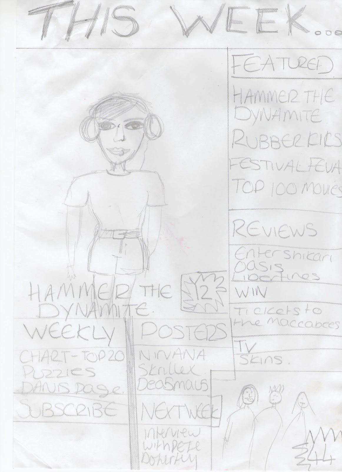 For the contents i have made a banner across the top of the page to be predominant so that it is the first thing to be read on the page in order for the reader to summarize the meaning of the page. I have made the main picture larger and to the left in order to leave enough space to make a column that will list the features of the magazine. I have added another picture in the bottom right corner to make the page more interesting.
No comments:
Post a Comment